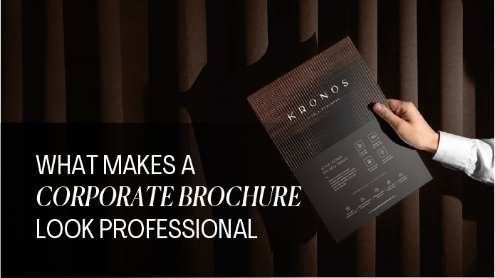
What Makes a Corporate Brochure Look Professional
Since the business world is dominated by digital marketing, you might assume that printed materials like brochures design may not be relevant anymore. But the truth is – corporate brochures continue to be one of the most powerful branding and sales tool. Whether handed out at meetings, shared at events, or sent digitally as a PDF, a well-designed brochure can instantly communicate trust, professionalism, and value.
However, not all brochures create a strong impression. Some look polished, credible, and high-end, while others feel cluttered, outdated, or untrustworthy. So what exactly makes the difference?
In this guide, we’ll break down what makes a corporate brochure look professional, covering everything from design and content to layout, printing, and common mistakes to avoid. This blog will help you create brochures that truly stand out.
What is a Corporate Brochure?
A corporate brochure is a marketing document designed to showcase your company, products, or services in a visually appealing and structured format. It acts as a snapshot of your brand, giving potential clients a clear understanding of who you are and what you offer.
It serves multiple purposes:
- Introducing your brand
- Communicating your value proposition
- Supporting sales conversations
- Building trust with potential clients
Types of Corporate Brochures
- Company Profile Brochure: Introduces your business, values, and mission
- Product/Service Brochure: Highlights specific offerings
- Sales Brochure: Designed to convert leads into customers
- Digital Brochure: Interactive PDF or online version
- Printed Brochure: Physical format for meetings, exhibitions, and events
Read More – Print Design vs Digital Design
Key Elements That Make a Corporate Brochure Look Professional
1. Clear Brand Identity
A professional brochure always aligns with your brand. When your brochure feels like a natural extension of your website, social media, and other materials, it builds trust and familiarity.
This includes:
- Consistent logo placement
- Defined brand colours
- Recognizable typography
- Uniform tone of voice
Pro Tip: Avoid experimenting too much with new styles that don’t match your brand, it can confuse your audience.
2. Clean and Structured Layout
A cluttered design is one of the fastest ways to look unprofessional. Clean brochures with enough white space is crucial. It gives your content room to breathe and makes the brochure easier to read.
A clean layout includes:
- Proper alignment using grids
- Balanced spacing (white space)
- Clearly defined sections
3. High-Quality Visuals
Images are a very important part of your brochures. If your budget allows, invest in dubai photography or branded visuals. They instantly elevate your brochure’s quality.
Professional brochures use:
- High-resolution images
- Consistent visual style
- Real photos (whenever possible)
Avoid:
- Pixelated images
- Overused stock photos
- Inconsistent visual themes
4. Compelling and Concise Content
Design attracts attention, but content keeps it.
Your brochure copy should be:
- Clear and easy to understand
- Focused on benefits, not just features
- Free from unnecessary jargon
Keep paragraphs short. Use headings and bullet point where needed.
5. Readable Typography
Typography plays a bigger role than most people realize. Good typography improves readability and readability keeps your audience engaged.
A professional brochure uses:
- 2–3 complementary fonts (not more)
- Readable font sizes (especially for body text)
- Proper line spacing
Avoid:
- Decorative fonts for body text
- Too many font styles
- Overly small text
6. Strategic Use of Colours
Colors influence perception. Random or excessive colour usage can make your brochure look unprofessional.
Professional brochures:
- Stick to brand colour palettes
- Use contrast for readability
- Highlight key elements strategically
For example:
- Bold colours for headings
- Neutral backgrounds for readability
- Accent colours for CTAs
7. Strong Cover Design
Your cover is the first thing people see and it determines whether they open the brochure. Avoid overcrowding the cover with too much text or multiple images.
A strong cover includes:
- A clear, impactful headline
- Minimal but powerful visuals
- Clean design
8. Consistent Visual Flow
A professional brochure tells a story. Each section flows naturally into the next.
It guides the reader through:
- Introduction
- Problem
- Solution
- Services
- Proof (testimonials, case studies)
- Call-to-action
Use headings, icons, and visual cues to make it intuitive.
9. Professional Printing & Finishing
If you’re creating a printed brochure, production quality matters just as much as design. If your brochures is of low quality, it can even make the best design feel generic.
Key factors include:
- Paper quality (thick, premium feel)
- Finish (matte, glossy, textured)
- Folding style (bi-fold, tri-fold, booklet)
10. Clear Call-to-Action (CTA)
Every brochure should tell the reader what to do next. Without a CTA, even a beautiful brochure loses its purpose.
Your CTA could be:
- Visit your website
- Call your team
- Book a consultation
- Scan a QR code
Make it visible, clear, and action-oriented.
Why a Professional Corporate Brochure Matters
A brochure is often seen as a small marketing tool but its impact is not at all small.
1. Builds Trust and Credibility
A clean, well-designed brochure signals professionalism. It tells your audience that you take your business seriously.
2. Strengthens Brand Identity
Every element from colours to typography supports your brand image.
3. Supports Sales and Marketing
Brochures communicate your value even when you’re not present.
4. Simplifies Complex Information
A well-structured brochure makes it easier for readers to understand your offerings. A professional corporate brochure bridges the gap between interest and conversion.
Read More – Top Social Media Design Trends Brands
Common Mistakes That Make Brochures Look Unprofessional
Here are some common mistakes that should be avoided is you want your brochures to look professional. Avoiding these mistakes is just as important as using best tips.
1. Overcrowded Design
Too much content leads to confusion in understanding the main purpose of your service.
2. Low-Quality Images
Blurry or generic visuals reduce credibility.
3. Inconsistent Branding
Different colours, fonts, and styles create a disjointed experience.
4. Too Much Text
Nowadays, when people have a really short attention span, long paragraphs discourage reading.
5. Poor Alignment
Misaligned elements look messy and unpolished.
6. Weak or Missing CTA
No direction means no action.
Print vs Digital Brochures: What Works Best?
Both formats have their advantages.
Printed Brochures
- Tangible and memorable
- Ideal for meetings and events
- Builds a premium brand feel
Digital Brochures
- Easy to share
- Cost-effective
- Can include interactive elements
Which Should You Choose?
- Use printed brochures for face-to-face interactions
- Use digital brochures for online marketing
- Use both is you want benefits of both printed and digital brochures.
Tips to Design a Professional Corporate Brochure
If you’re planning to create one, keep these practical tips in mind:
Start with a Clear Goal – What do you want the brochure to achieve?
Know Your Audience – Design and messaging should match your target market.
Keep It Simple – Clarity always beats complexity.
Focus on Value – Highlight what makes your business unique.
Review and Test – Check for errors, readability, and overall flow before finalizing.
Why Hiring a Professional Design Agency Makes a Difference
While DIY tools can be helpful, professional design agency bring expertise that can significantly improve results.
They offer:
- Strategic design thinking
- Consistent branding
- High-quality visuals and layouts
- Faster execution
More importantly, they understand how to design brochures that not only look good but also perform well.
Conclusion
A professional corporate brochure is a powerful tool that combines design, content, and strategy. It helps in creating a cohesive, clear, and compelling representation of your brand. From layout and typography to visuals and messaging, every detail matters.
When done right, a brochure can:
- Build trust
- Strengthen your brand
- Support sales
- Leave a lasting impression
So whether you’re designing one in-house or working with experts, focus on quality, clarity, and consistency, because professionalism is what truly sets your brand apart.