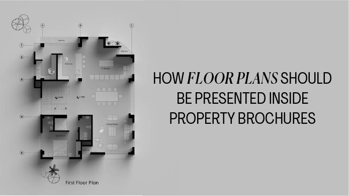
How Floor Plans Should Be Presented Inside Property Brochures
A clear floor plan that gives the buyer an understanding of how the property is laid out and whether it suits their lifestyle or business needs is one of the most important pages in the brochure. A professionally designed floor plan helps buyers imagine themselves living and working in the space. It answers important questions before a site visit, builds confidence, and streamlines the entire buying process.
Unfortunately, not many people place importance on presenting floor plans effectively. Small text, cluttered layouts, inconsistent colours, or confusing graphics can leave potential buyers frustrated. This is why the way floor plans are designed inside a property brochure matters just as much as the floor plan itself.
In this guide, we’ll explain how floor plans should be presented inside property brochures to make them informative, visually appealing, and more effective at generating enquiries.
Why Floor Plans Are One of the Most Important Pages in a Property Brochure
A property brochure is designed to answer buyers’ questions and explain how your property layout functions.
A clear floor plan helps buyers:
- Understand the property’s layout instantly.
- Compare different unit options more easily.
- Visualise furniture placement.
- Judge whether the space matches their lifestyle.
- Feel more confident before scheduling a viewing.
For commercial properties, floor plans also help business owners understand office layouts, customer flow, meeting spaces, and operational efficiency.
What Buyers Expect to See in a Floor Plan
Buyers prefer floor plans that are simple, informative, and easy to read. Here are the key elements every professionally designed property brochure should include.
- Clear Room Labels: Every room should be clearly labelled so buyers can quickly understand the layout, using simple labels like Living Room, Bedroom, Kitchen, Bathroom, and Balcony to make the floor plan easy to follow.
- Logical Room Positioning: The floor plan should accurately show how rooms connect. A logical layout helps buyers quickly understand how they would move through the property.
- Easy-to-Read Dimensions: Include measurements that are clearly visible, consistently formatted, and easy to compare.
- North Direction Indicator: A simple north arrow makes the floor plan clearer and easier to understand. It shows natural light, heat exposure, balcony direction, and energy efficiency.
- Entry and Exit Points: Buyers should immediately understand the main entrance, balcony access, garden access, emergency exits where applicable, and parking entry points.
- Furniture Placement: Furniture illustrations are optional but often very helpful. Showing a sofa in the living room or a bed in the bedroom helps buyers understand the scale of each room.
Common Floor Plan Mistakes That Make Property Brochures Less Effective
Even an accurate floor plan can fail if it isn’t presented well. Here are some of the most common mistakes design agencies and property marketers should avoid.
- Using Text That’s Too Small: Always choose font sizes that remain clear in both print and digital formats.
- Overusing Colours: Use a simple colour palette that highlights important areas while keeping the overall design clean and professional.
- Missing Room Names: Every important room should have a clear, readable label.
- Inconsistent Icons and Symbols: Doors, windows, staircases, lifts, and parking areas should use consistent symbols throughout the brochure.
- Poor Image Quality: Professional brochures should always use high-resolution or vector-based floor plan graphics that remain sharp in both print and digital formats.
- Forgetting a Legend: If colours, symbols, or patterns are used, buyers should immediately understand what they represent. This improves clarity without adding clutter.
- Ignoring White Space: Leaving enough space around the floor plan makes it easier to read, improves focus, and creates a premium appearance.
Best Practices for Presenting Floor Plans Inside Property Brochures
A floor plan should be easy to understand in just a few seconds. It needs to be clear, simple, and well organised.
Here are the key best practices for showing floor plans in a property brochure:
- Keep the layout clean and spacious.
A clean layout helps buyers focus on the floor plan. Avoid clutter and leave enough white space so everything is easy to read.
- Use consistent typography
Use one or two simple fonts across the brochure. This keeps the design neat and easy to follow. Avoid decorative fonts that reduce clarity.
- Maintain proper scale and proportions.
Make sure room sizes are shown accurately. Buyers should be able to clearly see the difference between large and small spaces.
- Highlight important spaces
Focus attention on key areas like the living room, kitchen, or master bedroom. Use subtle highlights to guide the viewer’s eye.
- Use colours strategically
Use soft, simple colours to separate areas or highlight features. Avoid bright or heavy colours that make the plan harder to read.
- Ensure print and digital readability
The floor plan should be clear in both print and digital formats. Text, lines, and images must stay sharp and easy to see.
- Use high-quality vector graphics
Vector files keep the floor plan sharp at any size. This ensures a professional look across brochures, websites, and presentations.
- Match the brochure’s branding
The floor plan should match the overall style of the brochure, including colours, fonts, and spacing. This creates a consistent and professional feel.
- Design for quick understanding
A good floor plan should be easy to understand at a glance. Buyers should quickly see the layout and key spaces without effort.
Should Floor Plans Include Furniture?
This is a common question in property brochure design. The answer depends on the property type and the audience.
When furniture helps
When it comes to residential properties, family homes, apartments, and lifestyle-focused developments, furniture can make a floor plan easier to understand by showing how large each space feels in real life.
When furniture should be avoided
In the case of luxury properties with minimalist style, or small rooms, adding furniture can make the plan look cluttered and inaccurate. That’s why it may be better to keep the layout simple.
The best choice depends on whether furniture will improve clarity or create confusion.
How Colours Improve Floor Plan Readability
Colour, when used with a purpose, becomes one of the easiest ways to improve a floor plan.
- Use neutral backgrounds
A soft white, light grey, or warm neutral background usually works well because it keeps the design clean and professional.
- Separate spaces gently
You can use light shades to separate rooms or zones. This helps the buyer understand the property without making the plan feel too graphic-heavy.
- Keep brand consistency
If the property brochure uses a specific colour palette, the floor plan should follow the same style. This helps the brochure feel unified and polished.
- Avoid too many bright colours
Bright or clashing colours may make the floor plan harder to read. In real estate marketing, clarity and trust matter more than decoration.
The Ideal Placement of Floor Plans Inside a Property Brochure
Where the floor plan appears in the brochure also affects how useful it is. A good floor plan should be placed where it supports the buyer’s decision-making process, not where they might skip it.
Best placement options
Floor plans usually work best:
- After the property overview
- After the key visuals
- Before amenities and lifestyle pages
- Near specifications and unit details
- Before pricing or enquiry sections
This flow helps buyers move naturally from emotional appeal to practical understanding.
Why it matters
A brochure usually starts with beautiful images to create interest. The floor plan should be placed where the buyer is ready for detailed information.
If it appears too early, it may interrupt the emotional flow. If it appears too late, the buyer may miss one of the most important parts of the brochure.
How Professional Design Agencies Make Floor Plans More Effective
A professional design agency does more than make a floor plan look good. It helps present the property in a clear and easy-to-understand way.
Here’s how they add value:
- Better information hierarchy: They highlight what matters most first, so buyers can quickly understand the layout without confusion.
- Clear visual flow: They connect images, floor plans, and details in a smooth way, so the brochure feels simple and easy to follow.
- Stronger branding: They make sure the floor plan matches the overall style of the property, giving it a more professional and consistent look.
- Print-ready quality: They prepare files properly so the final printed brochure looks sharp, clear, and exactly as designed.
- Better buyer experience: A clean and easy floor plan helps buyers feel more confident, which can lead to more enquiries and site visits.
A good design partner like The Marketing Socials helps make sure everything looks polished and works for real buyers.
Property Brochure Design Checklist for Floor Plans
Before finalising a brochure, use this simple checklist.
- Is the floor plan easy to read?
- Are the room labels clear?
- Are the dimensions accurate and visible?
- Is there enough white space?
- Does the design match the brochure branding?
- Are the icons and symbols consistent?
- Is the floor plan high resolution?
- Does it work in both print and digital formats?
- Is the north arrow included if needed?
- Is the layout simple enough to understand quickly?
A checklist like this helps prevent small mistakes that can affect the overall quality of the brochure.
Why Floor Plans Should Match the Overall Property Branding
A floor plan is not just a technical element. It is part of the property brand experience.
For example:
- A luxury development should have a refined, elegant floor plan presentation
- A family-focused residential project should feel warm and easy to understand
- A commercial property brochure should feel organised, professional, and functional
When the floor plan matches the brand personality, the brochure feels more convincing and professional.
Conclusion
A floor plan helps buyers understand the layout, visualise the space, and decide whether the property meets their needs.
When presented well, a floor plan improves the whole brochure experience, supports better decision-making, and strengthens the property brand. For design agencies and real estate marketers, the goal should always be the same: make the floor plan clear, attractive, and easy to understand. That is what turns a brochure from a simple marketing piece into a useful sales tool.
If your brand wants property brochures that look professional and communicate clearly, The Marketing Socials can help create designs that are visually strong, easy to read, and built to support real estate sales.
FAQs
How detailed should a floor plan be in a property brochure?
Clear enough to understand the layout at a glance, not overloaded with details.
What information should every property floor plan include?
Room names, basic measurements, entry points, and key spaces.
Should property brochures use 2D or 3D floor plans?
Both work—2D for clarity, 3D for better visual feel.
Where should a floor plan be placed inside a property brochure?
After the main images and before pricing or specs.
How can design agencies make floor plans easier to understand?
By keeping layouts clean, simple, and well-structured.
What are the biggest floor plan design mistakes in real estate brochures?
Cluttered layouts, tiny text, and unclear labels.
Why is branding important when designing floor plans for property brochures?
It keeps everything consistent and makes the brochure feel more professional.